Create your own theme
Learn how to create online group decisions in your own design. Choose colors and background graphics and save them in a theme for your polls, schedulings and prioritizations.
Log in first, to create your own theme. To create a design for your voting, survey or photo contest you need at least a premium account. You can log in with your e-mail address and password. Or log in to PollUnit via your Facebook or Google Account.
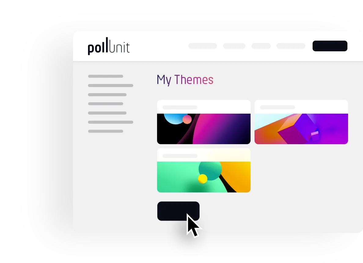
Your themes
Click on your name in the header and select »My Themes«. Here you see all your designs for your surveys. You can edit, delete or preview the themes here. To create a new design, click »Create a new theme« and the theme creator will open.
Theme maker
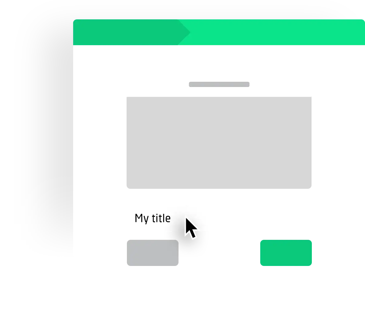
Step 1 »Basics«
Our Theme Wizard consists of 3 steps. Use the »Next« and »Previous« buttons to navigate between the steps. You can also edit existing themes by opening the wizard via the context menu of your themes.
Start by naming your theme.
Click on »Next to get to the background settings.
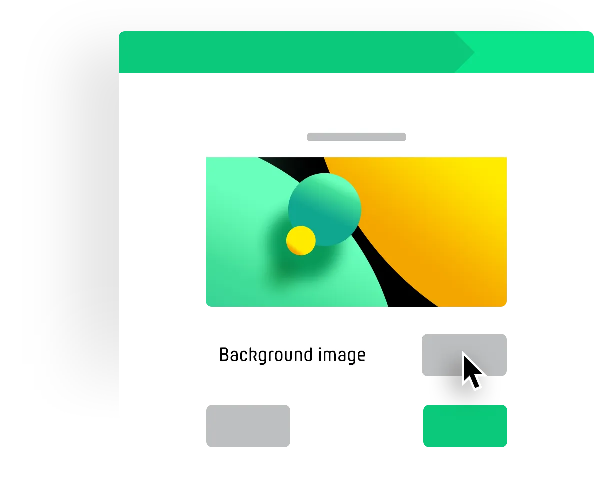
Step 2 »Background«
Confirm that you have the right to use the desired graphics. Check the appropriate field.
Now you can select your background graphics or drag'n'drop your files into the uploader. After uploading you will see a preview background image in our wizard.
Edit the colors and the font of your theme by clicking »Next«.
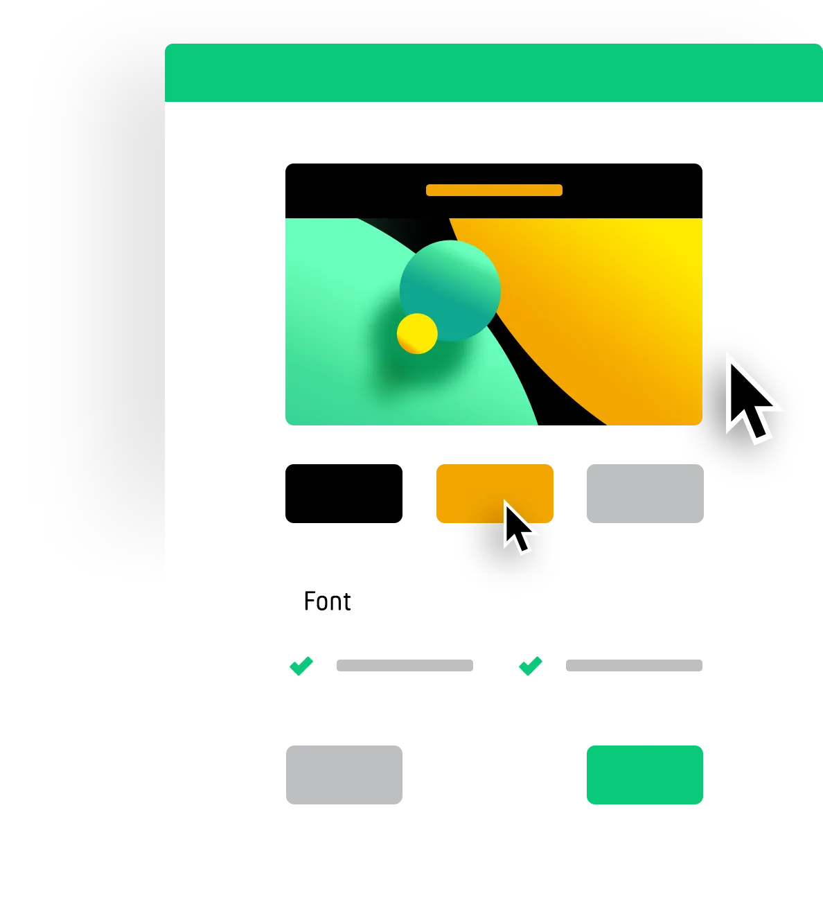
Step 3 »Colors / Font«
You can choose whether your headings should be displayed on the page with a colored background. This can increase legibility.
Choose your colors and check the preview how your theme changes.
Save and your design is ready for your next PollUnit.
in a unique design
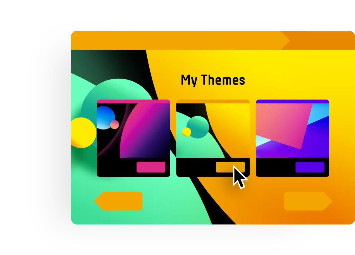
When you create a new survey, your themes appear in step 3 "Design" of the wizard. Here you can activate and and preview your theme.
You can also open the theme creator here, and add other custom themes.
Custom CSS
With a theme, people without programming knowledge can create polls, surveys and photo contests in their own design through a simple configuration. You can also create your own CSS (Cascading Style Sheets) via the context menu of each theme. This allows you to select elements of your PollUnit and control their presentation - completely individually, according to your needs.
This functionality is aimed at people with experience in HTML and CSS. If this doesn't mean anything to you, you should consult an expert.
Customize buttons
The following example shows how you can customize the appearance of all buttons with just a few lines of code. The button elements are selected, rounded to a pill shape and get a shadow-like outline.
.btn {
  border-radius: 9999px;
  border-bottom: 4px solid black;
}
Custom content and CSS per language
But the possibilities of CSS go much further. The next example shows how content can be changed localized, i.e. per language. Here the button for adding new options or images is selected, adjusted and then filled with new content.
#ccss-userActionBox .btn {
  text-indent: -9999px;
  line-height: 0;
}

#ccss-userActionBox .btn::after {
  text-indent: 0;
  display: block;
  line-height: initial;
}

html[lang=en] #ccss-userActionBox .btn::after {
  content: 'Localized button text';
}

html[lang=de] #ccss-userActionBox .btn::after {
  content: 'Lokalisierter Buttontext';
}
Custom fonts
You can also use your own fonts via CSS. You should make sure that your server allows »pollunit.com« in the CORS headers.
@font-face {
  font-family: 'Amatic';
  font-style: normal;
  font-weight: 200;
  src: url(https:/myhost.com/amatic.woff);
}

h1 {
  font-family: 'Amatic' !important;
  font-weight: 200;
}